
Neo-Brutalism in Squarespace: Bold Design That Breaks the Rules (In the Best Way)
This page may contain affiliate links. If you click on a link and make a purchase, I may receive a small commission at no cost to you. I only recommend products and services that I genuinely believe in and use myself.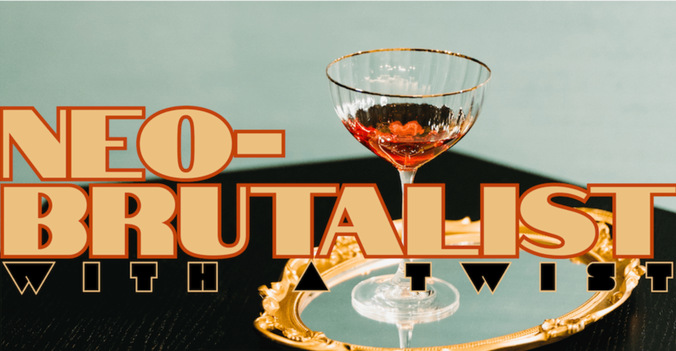
Ready to ditch the soft neutrals and minimalist trends for something edgier? Meeee toooooo! Neo-brutalism is one of the most talked-about web design styles of 2025 and it's surprisingly doable on Squarespace. With its bold typography, raw layouts, and unapologetic attitude, brutalist design helps small brands stand out online.
In this post, you’ll learn how to apply neo-brutalism principles to your Squarespace site, even if you're a solopreneur or designer working without code. I’ll cover what makes brutalist websites work, how to balance boldness with usability, and how to avoid making your site look messy instead of intentional.
I’ll be honest, I had step out of my usual design/comfort zone for this one, and it was so much fun! I learned a lot, and if you read to the end, I’ll share my thoughts.
So, if you're a DIY brand builder or web designer, this guide is your blueprint for building a Squarespace site that’s bold, raw, and unforgettable.
Table of Contents
What Is Neo-Brutalism in Web Design?
Neo-brutalism is a design style that strips away polish and embraces raw, functional aesthetics. Think high-contrast layouts, asymmetry, harsh grid systems, and large, type-driven headlines. It’s a direct response to overly “safe” design — and it's making waves across creative industries.
Unlike traditional brutalism (rooted in architecture), neo-brutalism is more adaptable and often paired with sleek UI for balance. It's especially popular in portfolios, agency sites, and edgy personal brands.
Why Brutalist Design Is Trending in 2025
I have to say, it’s not just now that' we’re seeing this type of design. When I was doing my research for this blog post, I read an article that dated back to 2023 in which they were discussing neo-brutalism emerging in the early 2010s! So while this isn’t “a new emerging trend”, it’s safe to say it’s popping and I’m here for it! Here’s why I think it’s trending this year:
It cuts through the noise. When most websites look the same, brutalism stands out.
It feels human. Raw layouts and unexpected elements feel intentional and artistic.
It’s emotional. Brutalist sites evoke reaction, curiosity, and confidence.
It's being used by thought leaders and disruptors. Which signals trend adoption.
It’s different, and brands want to be different. With AI, it’s tough to cut through the similarities.
This 2025 web design trend is especially powerful for creators who want their Squarespace site to make a statement.
Key Features of Brutalist Website Design
Monochrome or high-contrast colour palettes
Oversized headlines and heavy sans-serif fonts
Unstyled buttons or raw HTML-feel boxes
Asymmetrical layouts
Grids that break conventional flow
Large margins or gutters for breathing space
Minimal images, maximum text impact
How to Create Brutalist Aesthetics in Squarespace
For designers looking for asymmetrical layout inspiration in Squarespace, brutalism offers a practical and creative structure. Even without custom code, you can apply brutalist design principles using built-in Squarespace features:
1. Use strong typography
Choose bold sans-serif fonts like Space Grotesk, Bebas Neue, or Inter.
2. Build asymmetrical layouts
Use stacked index pages, collage sections, and unbalanced grid blocks.
3. Reduce image dependency, or not.
Brutalism is often text-first. Let your words and whitespace shine. However, play around with brand-related images that have interesting negative space for text, or weird geometric shapes. Consider using them as background or banner-style images.
4. Avoid rounded corners and soft shadows
Use sharp lines and squared-off buttons for a structured look. Increase your stroke width at least to 2px.
5. Embrace contrast
Black and white layouts or two-tone colour blocking are staples of this trend right now, but don’t be shy. Get crazy with retro colours.
6. Play with intentional “imperfection”
Offset elements slightly, use underlined links, and create visual tension.
Brutalist Fonts, Colours, and Layouts
Fonts:
Bebas Neue – Tall, bold, and commanding
Space Grotesk – Geometric with a tech edge
Neue Montreal – Minimal and utilitarian
Colours:
Black, white, grayscale with bold accent colours like neon green, cyan, or red.
Layout Ideas:
Two-column grids with oversize type on one side, text blocks on the other
Full-width banners with just a headline and CTA
Unstyled navigation or minimal headers
Common Pitfalls: Brutalism vs. Bad Design
While brutalism looks unrefined, there’s a difference between “raw” and “broken.” Avoid these mistakes:
Poor mobile optimization
Illegible font pairings
Inconsistent spacing or visual hierarchy
Too many competing elements on a single screen
Slow page load due to oversized fonts, graphics or images
Tip: Always test mobile first — especially when layouts break the grid.
Brutalism for Personal Brands & Creatives
This trend isn’t just for big agencies or artists — it’s a powerful way for personal brands, consultants, and creatives to communicate bold confidence and cut through visual noise.
If your brand values honesty, directness, or disruption, brutalist design reinforces that identity on a subconscious level. It’s a great choice for anyone building a creative portfolio website or edgy brand experience.
Neo-brutalist Website Examples
I had to ask for a little help when researching examples for this blog post. I prompted Gemini, and it gave me, interestingly enough, a few surprising ones. Let’s discuss:
Brutalist Websites
Wait, what? There’s a website dedicated to brustalist websites, you ask? Yup! This website is a directory of brutalist and neo-brutalist sites, and it's a great example in itself. It embraces the raw, unpolished aesthetic with simple HTML, some jarring colours, basic fonts, and a very direct, almost anti-design approach. It's an archive that perfectly exemplifies the style it curates.
Kurt Champion
This graphic designer and art director's portfolio site utilizes brutalist aesthetics effectively. It often features content organized into "cards" with strong borders, bold text, and a straightforward layout. The navigation might be less "smooth" than a traditional site, but it's clear and functional, emphasizing the content directly.
Teacherie
This site uses solid, flat color backgrounds with no gradients or fancy decorations. Text blocks are prominent and paired with relevant imagery in a way that feels almost "cut and paste." Sections are often visually separated by abrupt changes in background color, reinforcing the direct and unembellished style.
Studio Job
I must say, this particular site is one of the most creatively designed websites I have ever seen. Take a look at Studio Job, and while I've included a screenshot below, I recommend clicking on the link and exploring the site for yourself. I think Job Smeet, the founder of Studio Job, did an excellent job incorporating bold typography, vibrant colours and playful graphics. You’re left with raised eyebrows, shaking your head in astonishment.

My Version of a Squarespace Neo-Brutalism Website
Creating "Brutalicious" was an absolute blast, and honestly, a refreshing departure from typical web design projects. While I always value strategy and meticulous styling, this template allowed me to really lean into a different kind of creative freedom. It was incredibly fun to play with bold and bright color combinations against blacks and pastels, and embrace a more raw, unfiltered aesthetic without the usual constraints. This process felt less about rigid rules and more about pure, expressive design, letting me explore a vibrant, high-contrast world where the colors truly came alive. I also have a thing for borders and strokes lately, and I haven’t been able to apply it with client projects, so this was a nice switch up with creative freedom.
You can check out Brutalicious here