

Fall 2025 Design Ideas: 6 Cozy, Bold Trends to Inspire Your Next Website
This page may contain affiliate links. If you click on a link and make a purchase, I may receive a small commission at no cost to you. I only recommend products and services that I genuinely believe in and use myself.
As the digital leaves turn this fall, your website deserves a refresh that feels both cozy and compelling. Whether you're a DIY solopreneur, creative freelancer, or small business owner, staying on top of seasonal web design trends can help your Squarespace site feel fresh, intentional, and on-brand. From warm colour palettes and moody fonts to interactive storytelling and nostalgic design, Fall 2025 brings a unique blend of comfort and boldness to the web.
In this post, I’ll walk you through 6 cozy, bold web design ideas perfectly suited for Squarespace users—complete with tips on how to implement each trend and elevate your site experience just in time for autumn.
Autumn-Inspired Colour Palettes
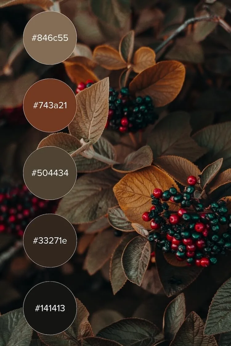
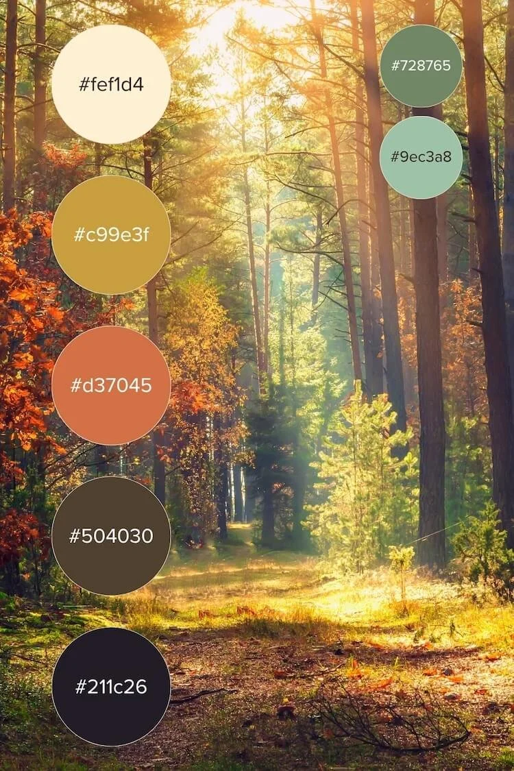
Colour trends for 2025 are shifting into warm, grounded palettes. Think burnt sienna, deep ochre, cranberry, pine green, and espresso tones. These palettes ground your design in warmth and seasonal relevance. They're perfect for coaching brands, lifestyle bloggers, or artisan shops who want to feel grounded and authentic.
My Top Autumn-Inspired Combos:
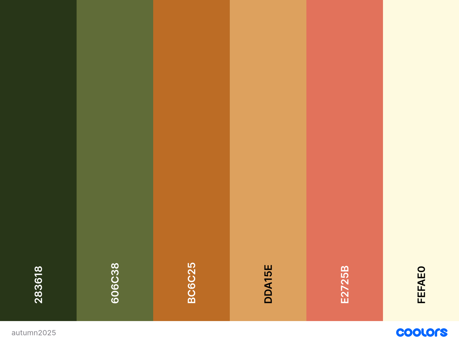
September is the moment of change, where you’re at a crossroads between summer greens, and bright yellow/orange beginning to take charge and change its colour. As fall progresses, these colours get deeper.
Pakistan green (#283618)
Dark moss green (#606C38)
Tiger’s eye (#BC6C25)
Earth yellow (#DDA15E)
Terracotta red/Burnt sienna (#E2725B)
Cornsilk (#FEFAE0)
This year, we’re going to see rich, bold neutral tones, potentially thanks to Pantone’s colour of the year (Mocha Mousse).
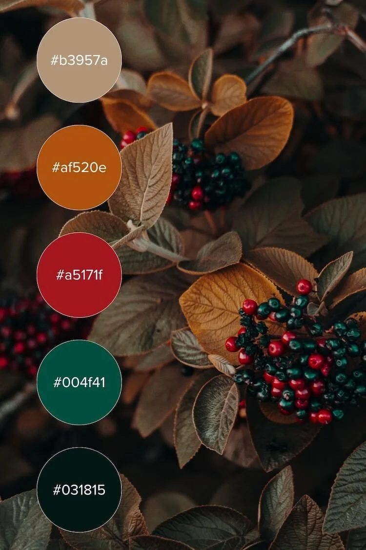
I’m also very pleased to see teals becoming a popular choice, as well as a rand of deep cherry, Bordeaux and luxury reds.
Use rich backgrounds with neutral text, and save brighter tones for buttons or hover effects.
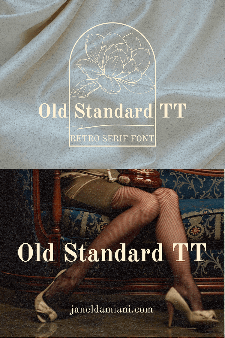
Moody, Retro Serif Fonts
Serif fonts with heavy contrast and elegant flares are making a strong return, especially in combination with minimal sans-serif bodies. Think Playfair Display or Canela for headers, paired with Proxima Nova or Source Sans Pro for body text.
Fall is the perfect time to mix bold serifs with cozy warmth: Try combinations like slab serif headers + clean sans-serif bodies, or handwritten serif accents.
Textures & Grains for Authentic Fall Feel
Web design in 2025 is embracing textured grains and organic shapes to smartly introduce tactile elements. Collage-style layouts using overlapping images, hand-drawn doodles, paper textures, or layered frames bring a sense of intentional messiness that feels lived-in and artisanal.
This trend pairs beautifully with Squarespace’s Image Blocks, Stack Sections, and custom backgrounds.
📷 Use Case: Ideal for portfolio sites, photographers, and product-based brands with strong visual storytelling.
Layer in:
Light grain overlays (5–10% opacity on sections)
Collage-style stickers or Polaroid frames (can be done in Canva or Adobe Photoshop)
Abstract, organic shape dividers
These bring a cozy, analog feel — perfect for fall.

Interactive Cursor Effects
Soft hover effects or even custom cursors add playful interactivity without needing code-heavy animations. For fall, imagine a warm-toned glow or leaf trail following your cursor on key sections like your call-to-action or shop page.
🖱️ Squarespace Workaround: While Squarespace doesn't allow .cur files, you can use custom CSS with hosted .png images or Lottie animations for hover elements. Want to learn more? Check out this blog post Add Motion Like A Pro: Micro-Interactions and Scroll Animations In Squarespace
Cozy Editorial Layouts
Editorial-style layouts with generous whitespace, oversized headlines, and full-width imagery create a relaxing and luxurious scroll. This trend suits solopreneurs and thought-leaders who want to elevate their message with a modern publishing feel.
📖 Use Case: Perfect for blog-focused Squarespace sites or long-form service pages.
Maximalist + cozy doesn’t mean chaotic:
One eye-catching element per section (e.g. bold header OR grain overlay)
Clear spacing between layers
Consistent colour/typography flow
Use white or neutral space to let bold visuals breathe
Examples of Cozy Editorial Layouts
1. Kinfolk.com
Why it works: Kinfolk uses classic serif fonts, large margins, generous line spacing, and a calm, neutral palette. It feels like reading a high-end magazine.
Key layout trait: Gridded photo-text alternation, immersive full-bleed imagery, and simple vertical navigation.
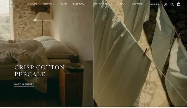
2. In Bed Store – inbedstore.com
Why it works: A lifestyle brand that blends commerce with slow-living storytelling. The homepage reads like a digital editorial spread.
Key layout trait: Soft colors, calm typography, and strong visual pacing with whitespace and cozy lifestyle photography.
3. The Gentlewoman – thegentlewoman.co.uk
Why it works: It’s a print magazine turned digital masterpiece, blending artful layouts with editorial hierarchy. Bold type meets delicate spacing.
Key layout trait: Minimal styling, story-led structure, subtle grid systems, and a cozy sense of rhythm.

Ambient Video Backgrounds
Short, silent video clips featuring flickering fires, city walks in the rain, or coffee steam loops can evoke an immediate mood. These are especially great in banners or hero sections.
🎥 Use Case: Lifestyle brands, personal portfolios, or service providers looking to increase emotional engagement.
Tips for Using Ambient Video on Squarespace:
Keep the file short (under 30s loop), muted, and compressed for web use
Use Squarespace’s Video Background block in the hero or full-bleed sections
Add a dark overlay if text sits above video
Choose MP4 or link from YouTube/Vimeo, and test mobile fallback images
Stick with moody natural footage, soft bokeh, or ambient environments (e.g., trees rustling, fabric flowing, steam rising)