

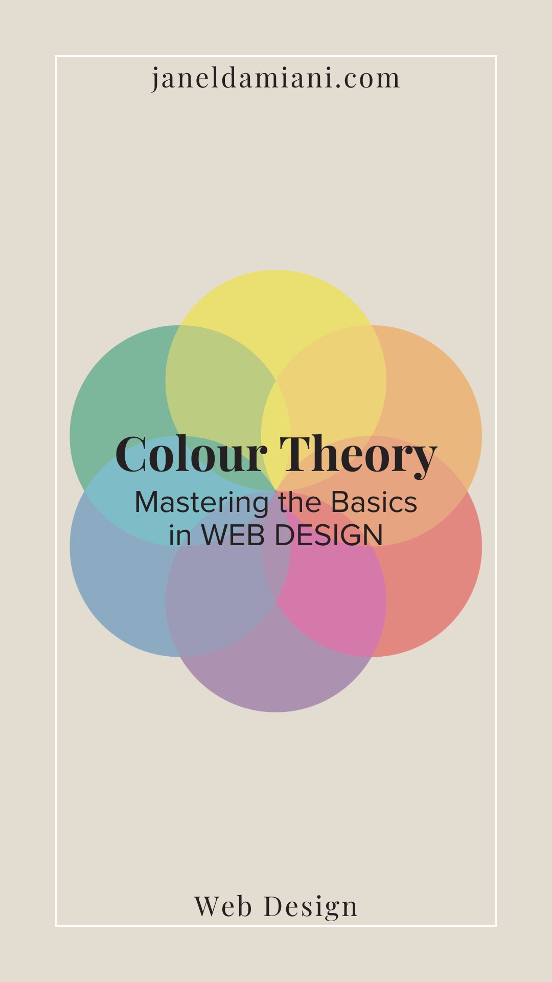
Mastering the Basics: A Guide to Colour Theory in Web Design
This post contains a product affiliate link. We may receive a commission if you make a purchase after clicking on that link, at no extra cost to you.The world of web design can be vibrant. Colours play a pivotal role in conveying messages, striking up emotions, and leaving lasting impressions on your customers. Understanding the fundamentals of colour theory is a major key to unlocking a visual language that can speak volumes about a brand's personality and identity.
In this blog post, I’m going to take you on a colourful journey; exploring the basics of colour theory, the “dos and don’ts if you will,” and, if you stay until the end I’ll share with you some of my favourite colour combos and which sites I use to develop my colour palettes in web design.
A Brief Mention of Where It All Started (Not a History Lesson)
*Disclaimer: I used Gemini to generate some names in history to create a brief piece of information in the next couple of paragraphs.
Colour theory is a discipline that you could research and find details from Sir Isaac Newton in the 17th century, and then Johann Wolfgang von Goethe later challenging his findings in the 18th century– both diving into the concepts of the visual colour spectrum.
Even earlier BC, you can research ancient cultures such as the Greeks and Egyptians using colour in their symbolism. All this to say, colour theory has ancient roots, but over centuries, has developed through contemporary and modern studies to bring us what we know today about colour; a mix of science, psychology, and design that keeps us growing and evolving.
If you’re new to colour theory, I highly recommend Googling “Colour Theory and its history” to learn more.
In this Blog Post:
Exploring the Basics: Understanding The Colour Wheel
Ready? Cool! Let’s take a stroll through the basics of understanding colour in design. Queue our friend, the colour wheel! The colour wheel is a spectrum of hues arranged according to their chromatic relationship.
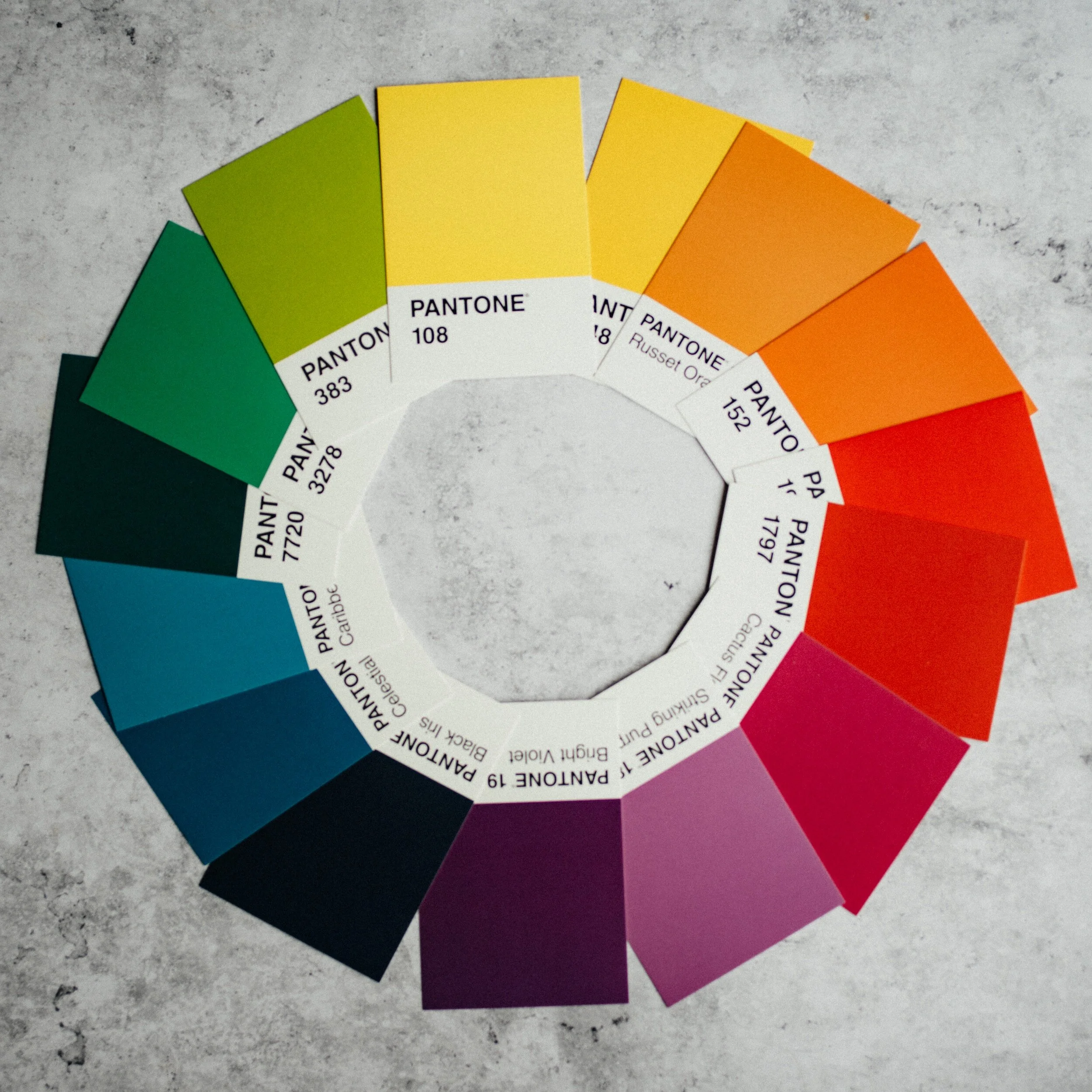
Photo: Unsplash
Check out this image I have here with swatches of colour, positioned flat, in a circle. You have your primary colours: yellow, red and blue, which are the foundation of all the rest. When mixed, they become your secondary colours–orange, purple, and green. Tertiary? Yep, you guessed it: yellow-orange, orange-red, red-purple, purple-blue, blue-green, and green-yellow.
Have you ever heard of colour harmony? This is where you pair certain colours together based on where they are located on the colour wheel. There are 6 types of harmonious pairings: Complementary, split-complementary, monochromatic, analogous colours, triadic colours, and tetradic colours.
Complementary Colours
When combining complementary colours, we’re creating a strong contrast between each hue by positioning points on the colour wheel that are opposite each other.
The key characteristic of complementary colours is that they contain no common colours, meaning they do not share a primary colour. When placed side by side, they intensify each other, making the combination visually striking and vibrant.
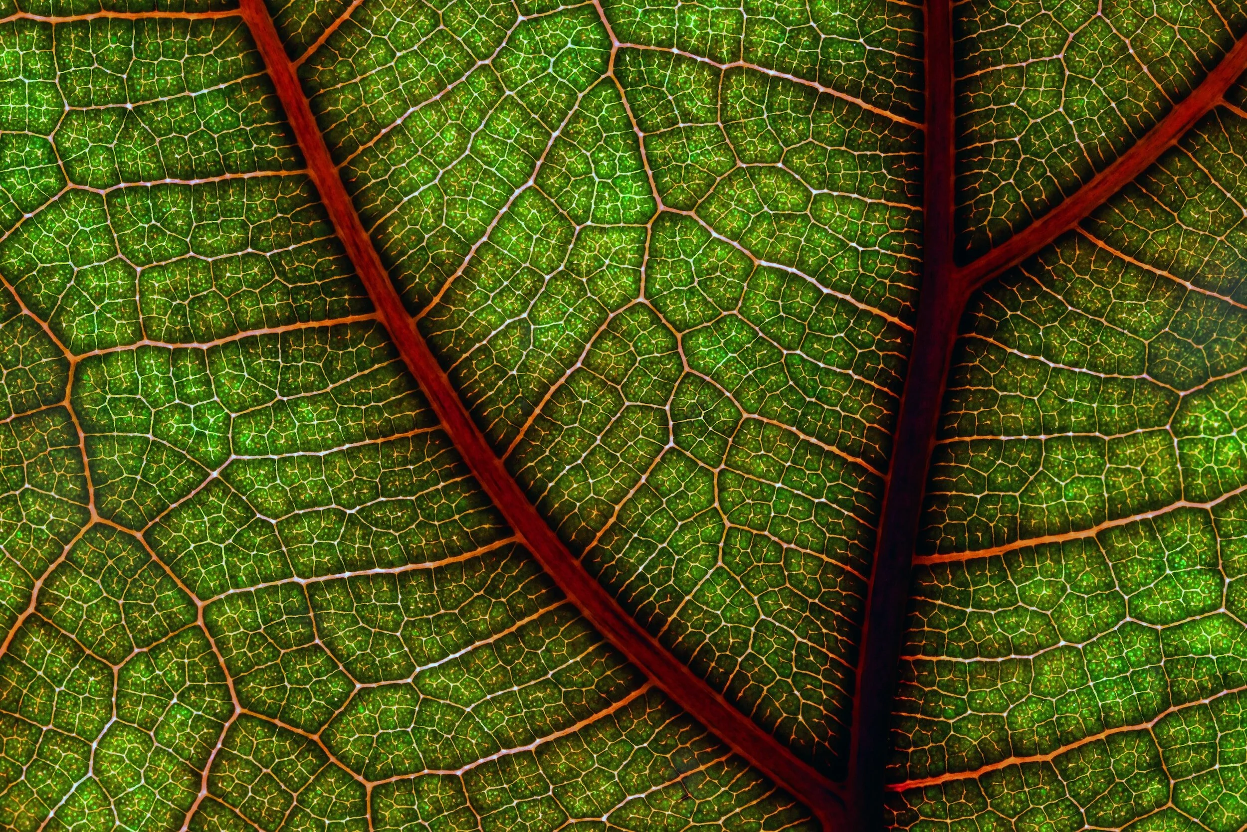
Complementary green and red from a leaf (Photo: Unsplash)
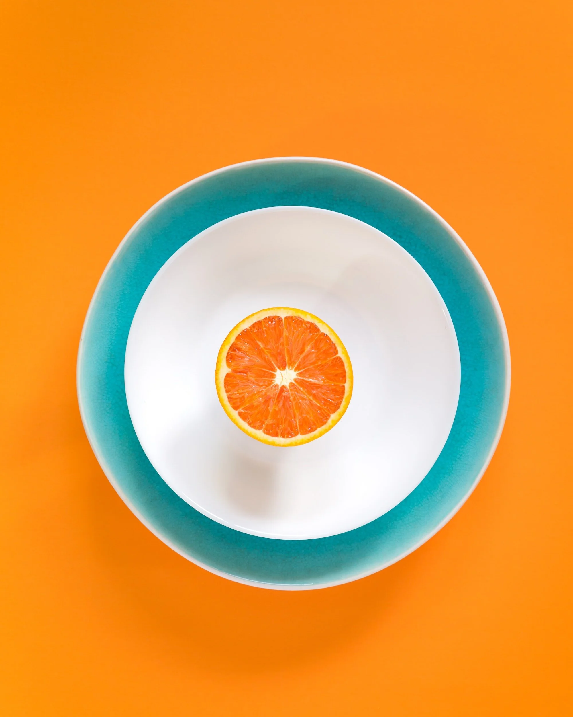
Complementary blue bowl and orange with an orange background (Photo: Unsplash)
Examples: complementary colour pairs are red and green, blue and orange, and yellow and purple (or violet). Did you know that if you mix these colours they can create neutral tones like gray or brown, depending on the proportions and intensity of each colour in the mix? Pretty neat.
In the design world, the use of complementary colours can create unique emphasis and focal points. Strategically, complementary colour schemes can add energy and zestfulness to a composition.
Let’s be cautious though, and apply this combination justly, as excessive use may lead to visual tension or overwhelm. Designers often leverage the potency of complementary colours in elements such as logos, advertisements, or buttons for CTA, to draw attention from the user. One good rule is the 60-30-10 and we’ll discuss that in a little bit.
Split-Complementary Colours
Similar to complementary harmony, split-complementary colours use a base colour, and choose the opposite hue from the colour wheel, only to take the adjacent colour and split it into two. I often enjoy using split-complementary colours as opposed to complementary ones because, at times, basic complementary colours can feel too intense. This choice still allows harmonious balance but maintains high contrast, which is great in branding and design. Incoming Dad joke, but, can you guess what else is too intense? …Camping!
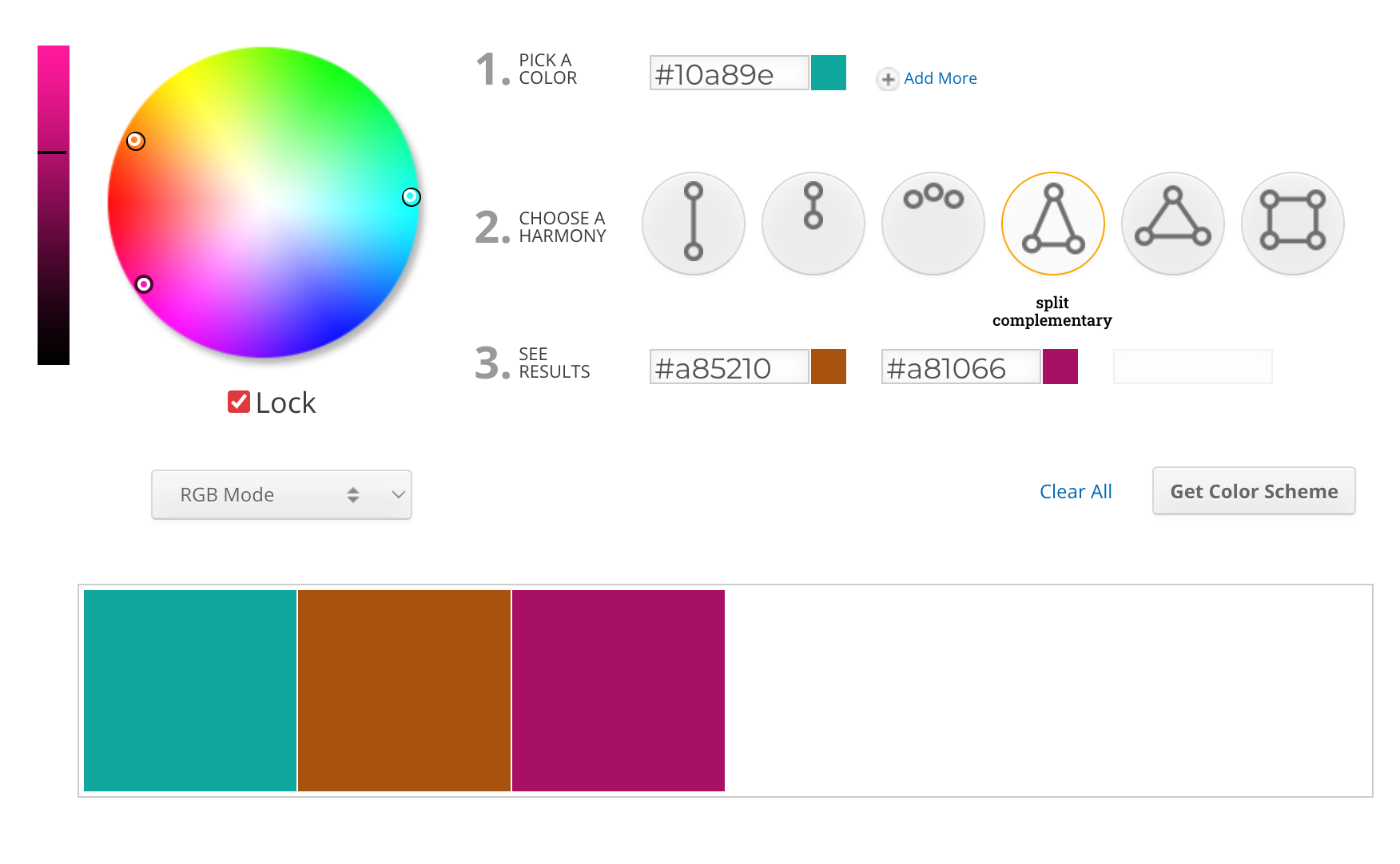
Photo: Screenshot of Sessions College color wheel
Monochromatic Colours
Monochromatic colours are all the colours (tints, tones, and shades) of a single hue. The base colour remains the same, but it is adjusted by changing factors such as brightness, darkness, or intensity.
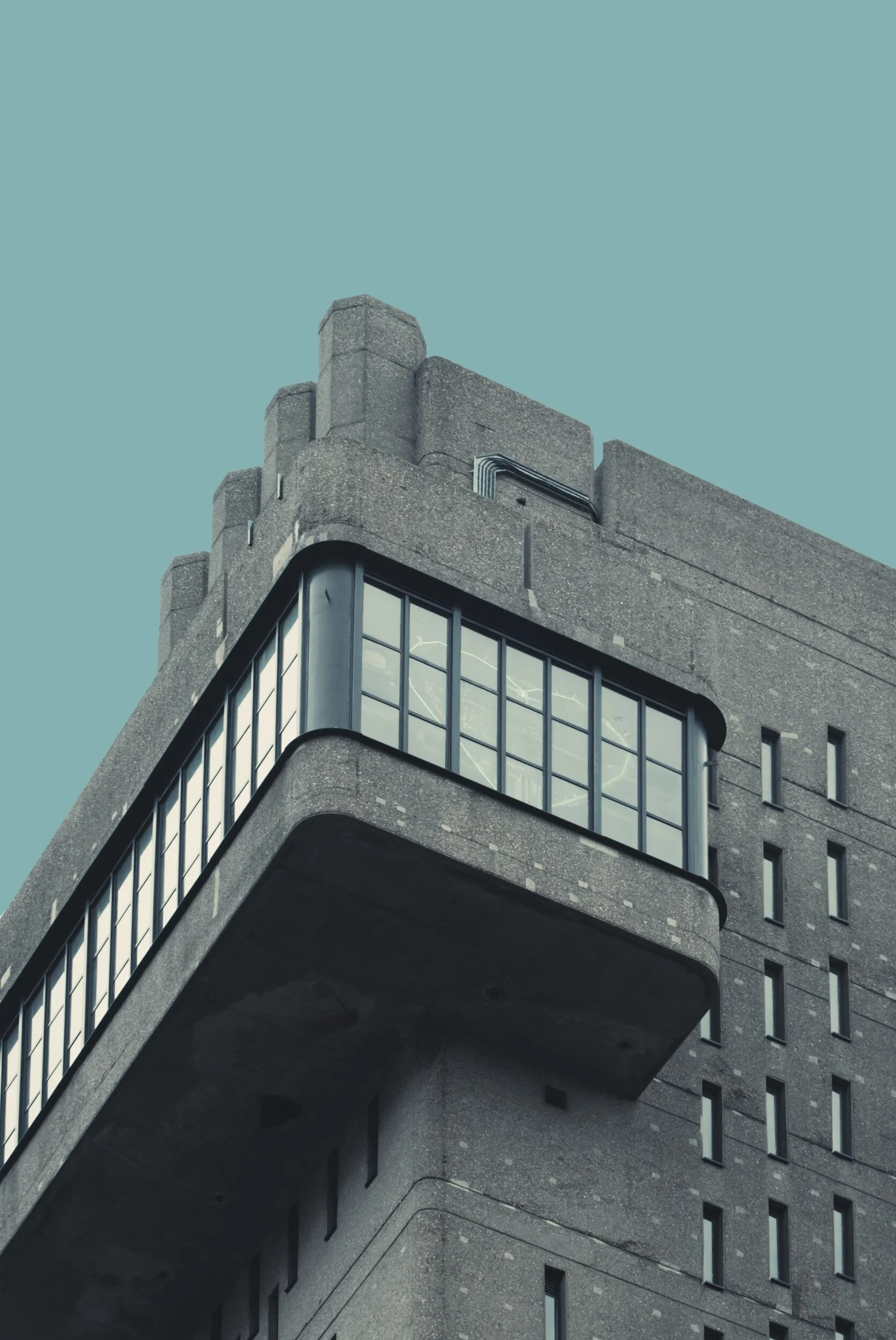
Photo: Unsplash

Photo: Unsplash
The examples above: If blue is chosen as the base colour in a monochromatic scheme, the palette may include light blue, medium blue, and dark blue. This can create a calm and soothing feel to a design, as the colours share a common visual identity.
Analogous Colours
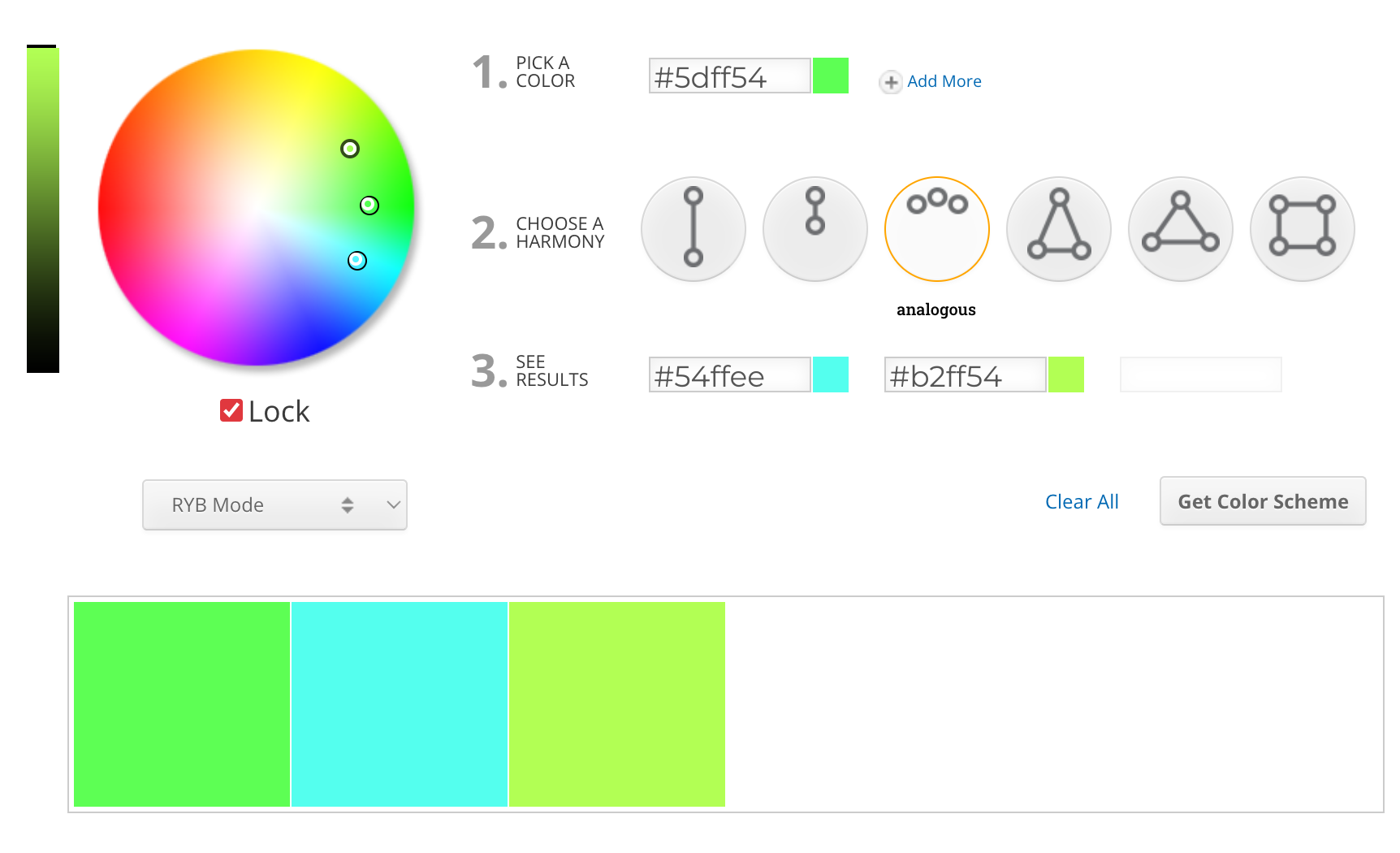
Photo: Screenshot of Sessions College color wheel
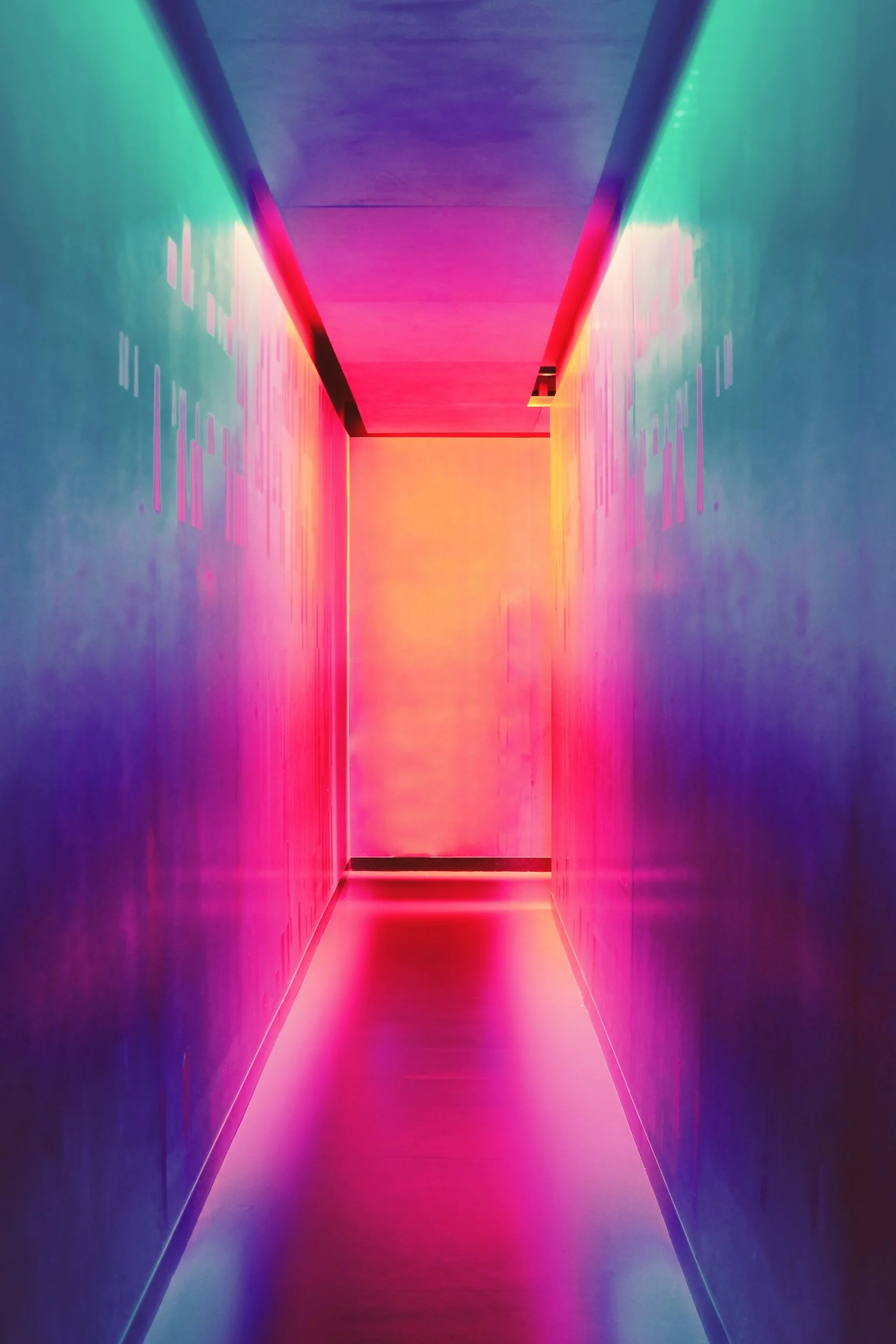
Photo: Unsplash
Analogous Colours hang out next to each other on the colour wheel. Think of the same hue with different variations to their shade. Typically, you’ll see three colours from the colour wheel to make up this harmony.
It’s trending lately (2024). You’ll see websites, and designs–from graphics to interiors, and gradients–using this harmony to evoke a particular mood.
Some examples include blue, blue-green, and green which give the vibes of the Caribbean, or even the sunset with reds, orange, and yellow-orange. I can admit, I love this harmony as well. It can be both subtle and interesting, giving a sense of unity, and balance but in a certain respect. The image with the lime greens and blue is harsh, don’t you find? The hallway with pinks and purples is more tasteful. I’ll discuss all these neon colours further down, and some things you may want to avoid.
Triadic & Tetradic Colours
Here are two exciting colour harmonies that can create striking and dynamic colour palettes.
Triadic colours take three corners of the colour wheel. They’re always equally spaced apart to create a strong and balanced visual for the eye. The trick to a triadic palette is to pick one dominant colour and use the other two for accents or highlights.
Tetradic colours are two pairs of split-complementary colours. This dynamic tension can be quite powerful, so use it with caution as it can feel overwhelming with its energy. A good tip for applying this combination of colours is to think of shades and tints for depth, add black or white for some balance, and consider the warm and cool palettes for a better harmonious feel. Play around and experiment with these combinations and see what resonates with you.
Here are some of my favourite examples of a triadic or tetradic colour scheme:

Superman’s iconic outfit features triadic colours of blue, red and yellow. Photo: Unsplash
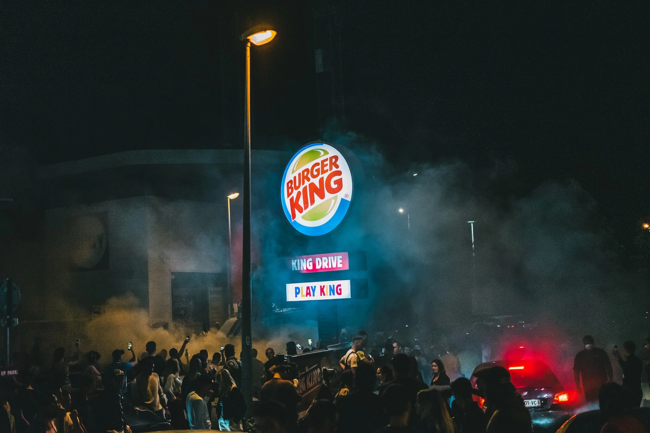
Burger King’s logo uses a triadic colour scheme of the primary colours red, blue, and yellow. Photo: Unsplash
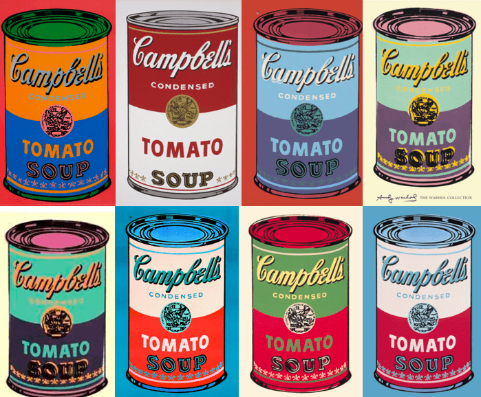
Andy Warhol’s iconic Campbell’s Soup cans. Source: revolverwarholgallery.com

Slack’s Logo uses tetradic harmony. Source: Unsplash
CHECK OUT WHAT WE'RE LISTENING TO!Our creative space is always playing great tunes to keep our day vibrant
Benefits:Motivation and energy: Upbeat music can boost your mood and energy levels, leading to increased focus and productivity.
Creativity and inspiration: Instrumental music or music with lyrics that resonate with your project can spark new ideas and help you think outside the box.
Focus and concentration: Certain types of music, like classical or ambient, can help you zone in and block out distractions, improving your concentration.
Flow and rhythm: Music can create a sense of flow and rhythm, which can be helpful for tasks that require repetition or a steady pace.
Harmonious Designs: Mastering Colour Combinations in Your Projects
Ah, colour! Isn’t it lovely? Colour can change everything, from our mood to the way we look in clothes and even in spaces in interior design. Colour can be tricky, and sometimes when it comes to web design, you can feel a little stuck, or even overwhelmed by the options in colour palettes! I know I do. Sometimes I find myself just skimming through combinations for much longer than I should be!
Learning the language of colour can be easy with a few tricks. I appreciate the 60-30-10 rule when it comes to making your colour palette balance in a design. As Free Code Camp suggests, the rule says that the primary colour should take up 60% of your design, while the secondary colour grabs 30% and 10% is left over for your accent colour.
To achieve a sense of balance, it's important to ensure that no single colour or element dominates over the others. This rule can help you achieve the desired equilibrium in your design. Having 3 established colours is always best, as it prevents overwhelm in colour combination. If you’re using the tetradic colour harmony, however, just be careful and follow a few guidelines:
Equal portions can overwhelm: Don’t use all 4 colours in equal amounts, appoint a dominant, primary colour for 60% of your design, and then use your secondary as 30%, followed by your third (and fourth if there is one) for the remaining 10% better known as the accent colours. Think highlighted words, buttons, lines, shapes and accessories.
Consider colour harmony: Ensure your colours work well together and don’t create any visual chaos.
Test for accessibility: Check the contrast and readability of text against the chosen colour scheme. Make sure it’s accessible for a wider audience including those with colour vision deficiencies.
Experiment with shades and tones: This can add depth and dimension and help prevent flat appearances within your design.
Always try and maintain consistency: Apply your scheme across various elements in your design as consistency enhances unity and ensures a cohesive visual experience.
The Psychology Around Warm & Cool Colours In Graphic Design
Warm Colours: Dynamic, zesty
Warm colours, like the sun rising and setting, or juicy oranges and red hot peppers are often associated with feelings of excitement, heat, passion, and energy. They can make you sit up and take notice, feel alive or get you feeling excited.
In graphic design, warm colours are often used to create eye-catching visuals, promote active engagement, and convey a sense of warmth and friendliness.
For example, a fast-food restaurant might use a red and yellow colour scheme to stimulate appetite and encourage impulse purchases. When you see that big orange Call-to-Action button on a web page, you’re near begging to click. I know I am.
Cool Colours: Tranquility, Peace & Calmness
Cool colours, such as blue, green, and purple, are often associated with feelings of peace, and serenity. They can promote relaxation, create a sense of trust and security, and evoke feelings of professionalism and sophistication.
In graphic design, cool colours are often used to create inviting environments, promote focus and concentration or even convey a sense of authority and reliability.
For example, a spa might use a blue and green colour scheme to create a relaxing atmosphere and promote feelings of well-being.
Don’t ever feel like these examples are must-dos. Neutral tones, like browns, off-whites, or sage greens can also give a sense of calm as well. Explore every hue and its tone; expression and emotion can come from so many combinations!
The Power of Balance
The effective use of colour in graphic design often lies in the balance between warm and cool tones. Using too many warm colours can create a sense of overwhelm or aggression while using too many cool colours can create a sense of coldness or sterility.
Sure, warm and cool colours have their vibes–like fiery excitement vs. calm chill. But the truth is, colour psychology is way more than just a simple temperature gauge. Different cultures see colours differently, your mood can play a part, and how you use them in a design matters a ton. If you’re new to web or graphic design–get strategic. Think about the message you and your client are trying to send and pick the colours that will nail it to their audience. Colour is indeed a superpower.
Bad Colour: Avoid These Combinations In Your Designs
So with all that said above, colour theory in the design world is wonderful when used appropriately. But just like any tool, if used incorrectly, it can backfire. So, while we're all for bold choices and creative expression, some colour combinations are best left untouched. Let’s talk about some combinations we should avoid.
Neon Nightmare:
Imagine walking into a disco decorated with highlighter yellow walls and pink strobe lights. Now picture that sensation translated onto a website or graphic design. Neon colours up close can be overwhelmingly vibrant, causing eye strain and it can be quite difficult to focus on any specific element.
Think radioactive green paired with electric blue or hot pink clashing with lime green. Use neons sparingly, as accents or highlights, and always pair them with calming neutrals to avoid inducing headaches and nausea.
Now you may be thinking, “Sure, I get you, but what about all those awesome pictures where everything is neon? Is this considered clashy?” Ahem. Art is subjective, my friend. It’s clashy, yeh. Just be mindful of how you’re using neons in your designs.
Take the examples below: I know this can be controversial, and yes, as I said: art is subjective. But there’s something to be said about the image with yellow and pink neon vs the image with pink neon against a deep blue background and jean jacket. Which one would you use in your designs? And what about a website?
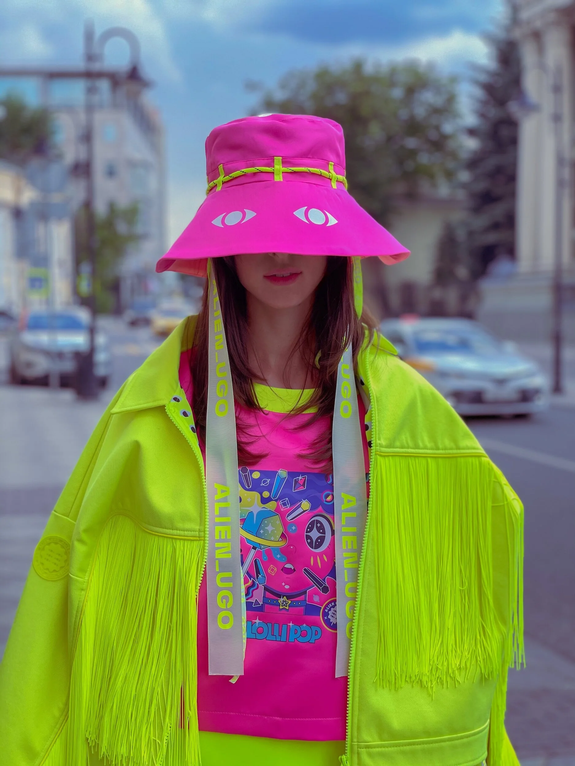
Photo: Unsplash
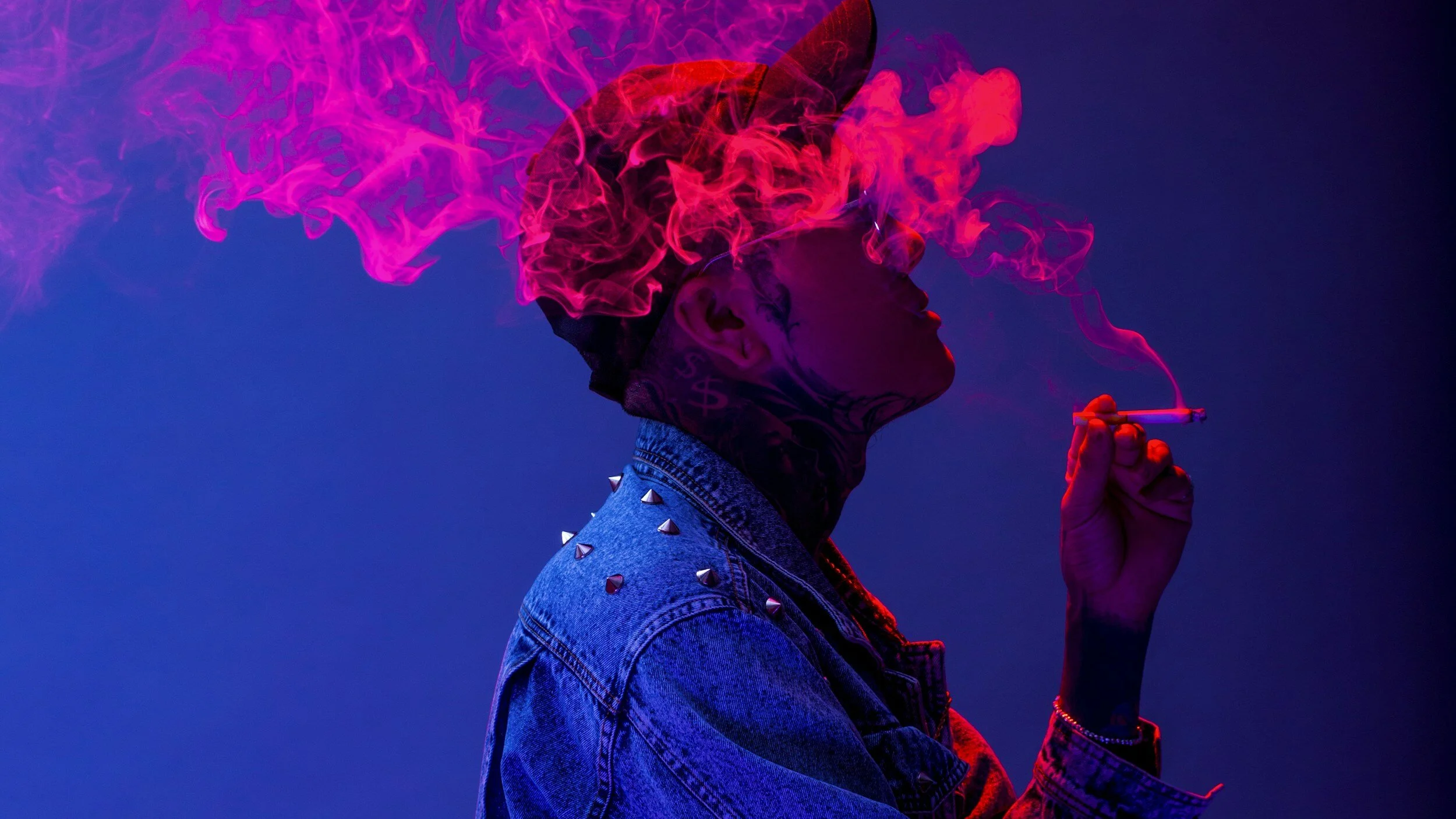
Photo: Unsplash
Dark on Dark:
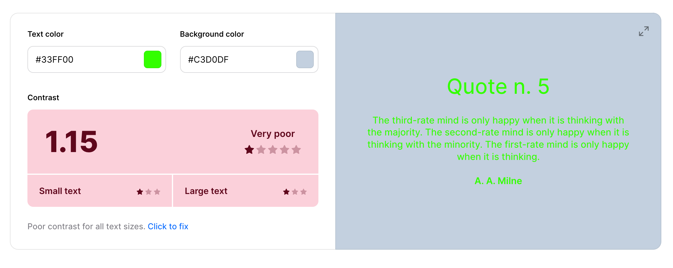
The greatest issue with two dark colours paired together is the lack of contrast. Contrast is non-negotiable when it comes to readability and visual hierarchy. It can make your eyes tired, and information can get lost in a composition.
Dark palettes tend to create a flat, undifferentiated look and can be associated with negativity. Folks with visual impairments or colour blindness will find it difficult to read as well.
Hey, I’m all for dark colours, don’t get me wrong here, it’s just very important that you use them with other colours that will complement the design. Make sense?
I also want to point out that dark-on-dark can work in certain situations when used intentionally. Luxury brands or high-end products can benefit from a sophisticated swatch that is dark, being sure to use accented highlights and textures like gold, silver, and white, creating a sleek and subtle look.
Designer Faux Pas: Using dark colours creates a flat design and is unlegible. Photo: Coolors Palette Visualizer
Contrast is Key: Using lighter hues and tones creates a visually pleasing design, easier to read text and adds depth to its contents
Monochromatic Maybe-not:
In my opinion, monochromatic colour schemes can be sophisticated and elegant, but pushing it too far can lead to a dull and monotonous design. Picture a website with every single element, from the buttons, background and all, using the same shade of green.
Ever walk into a modern home, only to have the walls, furniture, pillows and accents all in shades of grey? Monochromatic palettes can work wonders, but adding subtle variations in tone, texture, or even a single contrasting element can breathe life into your design and prevent it from becoming a snoozefest.
Colours Can Vibrate:
It’s true! Colours can vibrate and it’s not very pleasing. Two different phenomenons can happen:
(*Disclaimer: I used Bard to spit off a few bullet points for the two examples below and created some paragraphs to describe them)
1. Optical Vibration:
When you place two highly saturated, contrasting colours close together, especially if they share similar brightness levels. The edges of the colours appear to shimmer or flicker slightly, creating an illusion of movement or vibration.
This is due to the way our eyes and brains process colour and light. The conflicting wavelengths of the adjacent colours can cause our vision to struggle to focus, resulting in the vibrating effect. It can often feel like your eyes are hurting or struggling.
This type of vibration can be aesthetically unpleasant or distracting, making it an important consideration for graphic designers and artists.
2. Psychological Vibration:
This is more metaphoric and refers to the emotional impact certain colours can have on us. Some vibrant, intense colours like red, orange, and yellow can evoke feelings of excitement, energy, and even urgency. They can feel "alive" and pulsating, hence the association with vibration.
This psychological sensation is less about actual visual movement and more about the feelings the colour evokes. Designers and artists can use this phenomenon to create specific moods and atmospheres in their work.
Therefore, depending on the context, "vibrating colours" can either describe a physical optical phenomenon or a more subjective psychological reaction.
Ouch! It’s hard to read the green text.
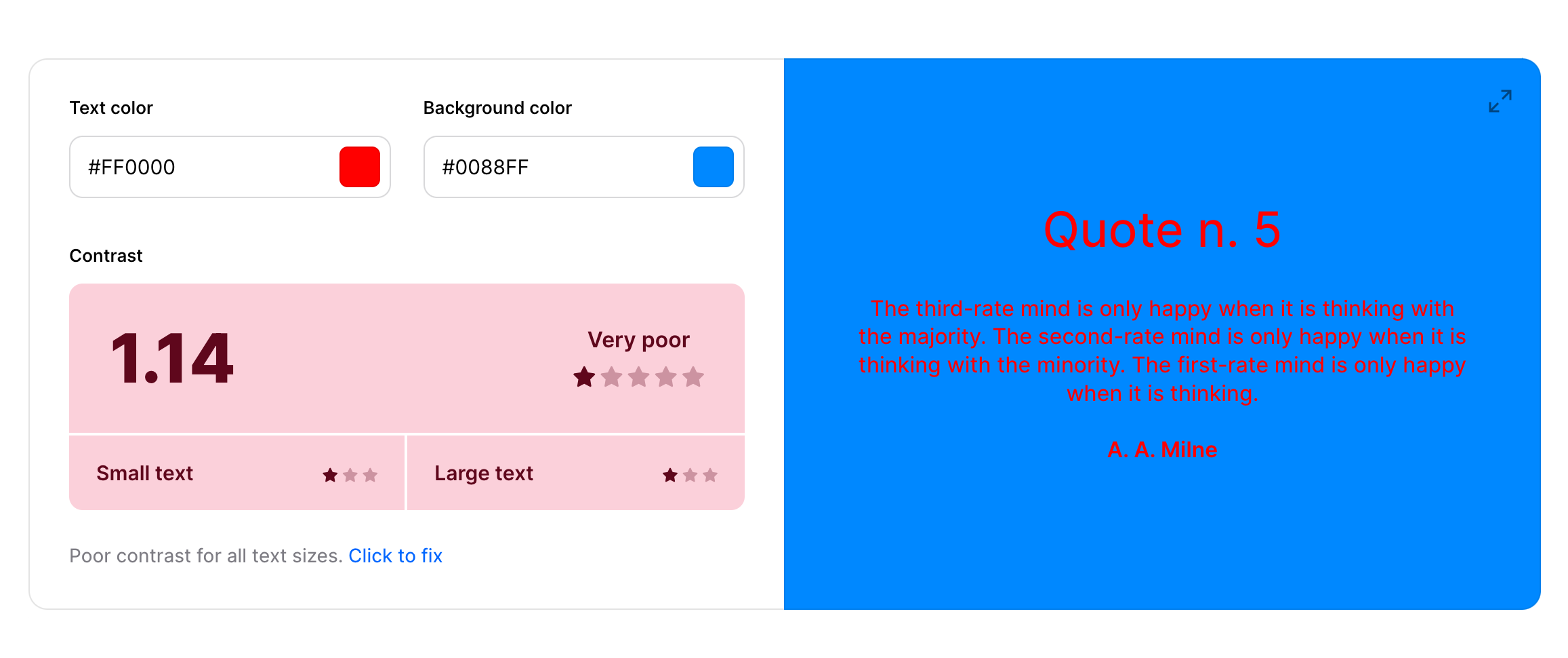
How does this red feel to your eye?
My Favourite Sites For Creating Colour Palettes
Okay, before we wrap things up, it’s time for some colourful fun! It’s important to always have a couple of colour sites bookmarked for when you’re looking for colours in your projects. Sites that you feel comfortable navigating through and easy to work with.
I’m excited to share with you some great links where you can search for colours and create palettes for your next design project.
Sessions College Color Wheel
Sessions College is where I studied digital media. Their accredited programs are excellent if you’re looking to study 100% online through correspondence. I’ve continued to use their colour wheel when choosing the right harmonies in my designs because their selectors put the colours and their hex codes together so you can see them next to one another and move the sliders around to make the best decision.
Coolors
Coolors.co is a great site for playing with colours in many different ways. Check out my video below on how I create a simple colour palette using Coolors:
*Coolors is just the best! If you love Coolors.co you can use this link HERE and Go Pro to unlock all their Premium Features
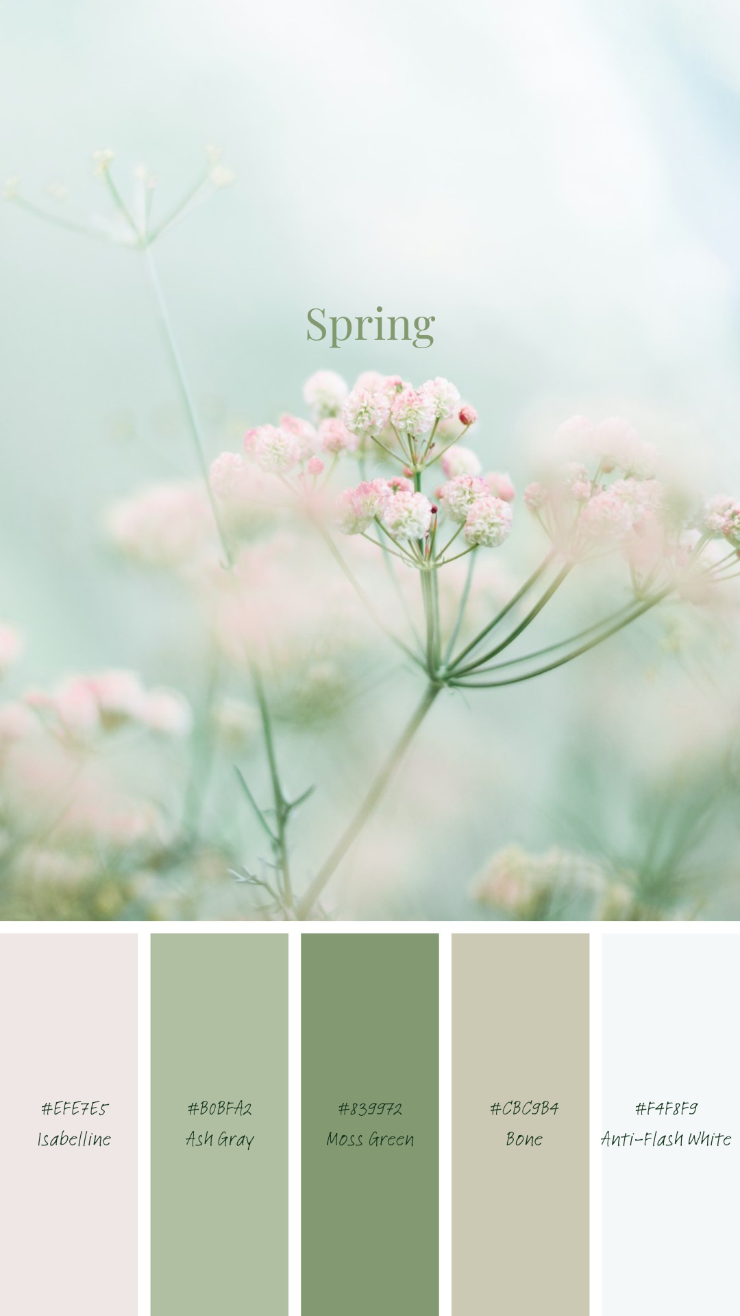
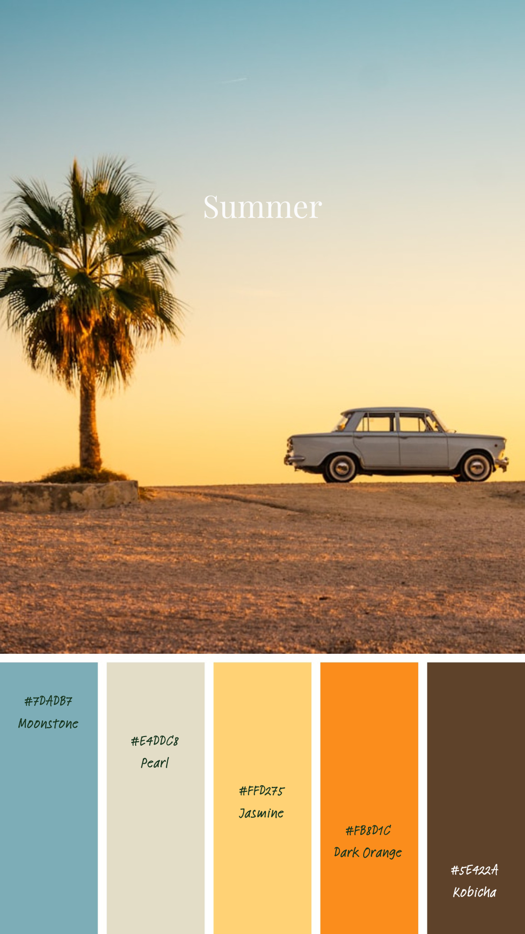
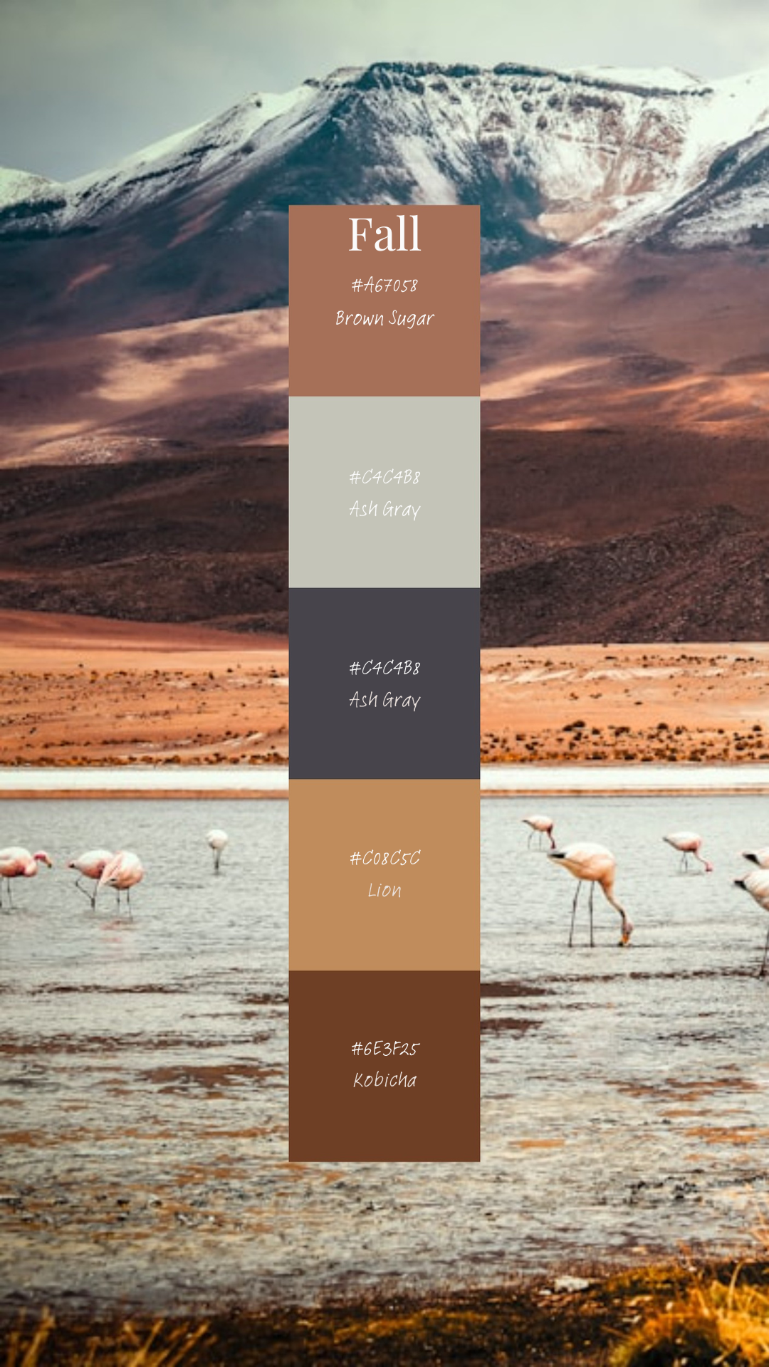
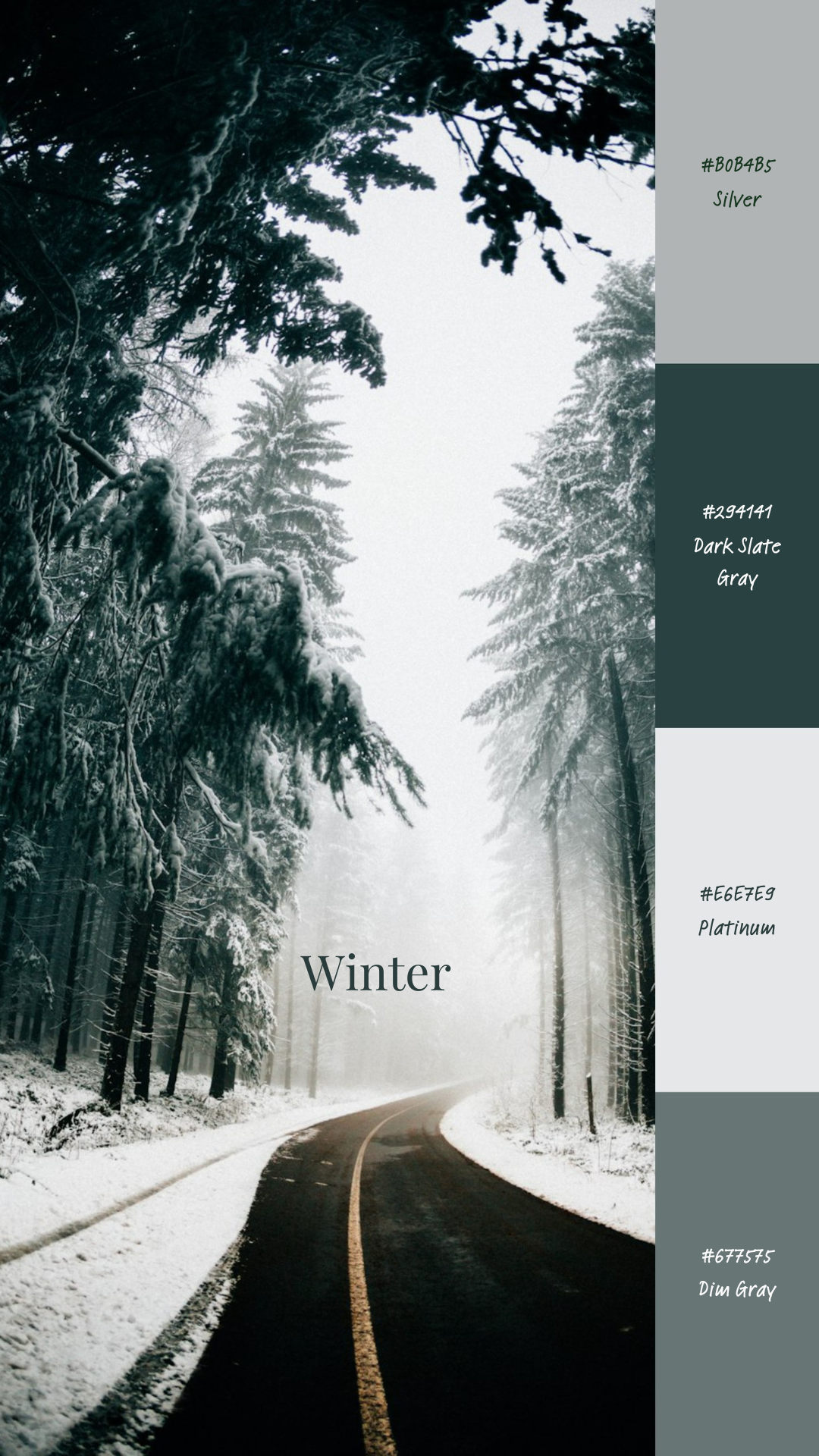
As you can see above, I’ve created four colour palettes from images from Unsplash. I must admit, I really love the fall and winter palette; warm and cozy deep tones, and icy cool blues and silvers. If you like them, be sure to pin them to your board on Pinterest!
I hope you found this post helpful, leave a comment below and tell me what your favourite colour combos are! If you want to be a part of our community, don’t be shy and leave your email below to sign up to our newsletters!