
10 Trending Squarespace Font Pairings In Squarespace To Make Your Website Stand Out
Tell me the truth. Do you find yourself scouring the web for the best fonts to use in your web design? Are you on Pinterest or Google Fonts, only to have gone through just a fraction of the fonts available?
Browsing for fonts can be so satisfying as a designer, but, when it comes to choosing the perfect pair, it can take a really long time. After all, you’re the expert! You want to make sure the font pairings you choose are suitable for your client’s personality and brand (or yours!), and let’s face it; there are so many wonderful fonts to choose from. The search can cause decision fatigue–I know, I’ve been there.
Fonts play a crucial role in creating a visually appealing and cohesive design. By combining different fonts more strategically, you can make your design stand out impressively.
In this blog post, we’ll explore 10 stunning font combinations you can try right now using Squarespace. We'll explore trending Google Fonts, from classic pairings of elegant serifs with modern sans-serifs to playful scripts juxtaposed with clean, minimalist fonts. Get ready to elevate your Squarespace site and make it a true standout!
But first, let’s lay some groundwork.
The Importance of Font Pairings In Web Design
You know, I’ve read this a lot, and I agree: Font pairings are essential because they help create visual harmony and hierarchy on a website. When chosen thoughtfully, font combinations can enhance readability, convey brand personality, and create a memorable user experience.
By selecting the right fonts for your Squarespace site, you can establish a cohesive and professional look that resonates with your target audience.
That’s all true, but a deeper understanding of its impact on user experience exists. It’s an art wherein it takes a level of skill to arrange your designs to make written language legible, readable, and visually appealing. You have to select the right typeface, its sizes, its spacing, and consider other elements to create an effective and harmonious design.
Consider these key aspects when designing your website
Legibility
The purpose of choosing the right typeface is to make your visitors’ experience readable. And just because there’s a font out there, doesn’t mean it is readable. Consider font size, line spacing, and leading when choosing fonts for longer paragraphs.
Hierarchy
When it comes to headings, subheadings, and body text, consider sizing, weights, and variations on the font style to make everything more distinguishable. It allows the reader to easily scan your copy and it helps improve UX (user experience.)
Personality
Fonts have personalities of their own so they can help you set the mood for your page. Think about your brand’s personality and apply it to the text. Is your site more elegant and sophisticated? Or is it minimal, and clean?
Consistency
Stay consistent in your design by choosing a maximum of 3 fonts. Use the first two as your key players, and leave the 3rd for accents, buttons, or anything else you plan to use very sparingly. It’s also most important to use these throughout your brand. Think beyond the website - Social media platforms and ad designs both online and offline.
A Few Bonus Tips
Thinks about contrast when pairing fonts. Using different styles or weights will create more of a visual interest.
Do consider similarities to maintain some sense of unity and intention.
Brand personality should always be top of mind. Professionalism and sophistication should never use childlike or creative fonts, much like artistic and vibe-like brands shouldn’t use classic or serifs.
This one is non-negotiable: Readability. No matter how sick this font looks, if we can’t read it, we don’t use it.
Never use Papyrus
Understanding Squarespace Fonts
Squarespace offers a wide range of fonts that are carefully curated to ensure readability and versatility across different devices. From classic serif fonts to modern sans-serif typefaces, Squarespace provides options to suit various design preferences.
Familiarizing yourself with the available Squarespace fonts will help you make informed decisions when selecting font pairings for your website. Make lists and keep a tab of those you favour for your designs.
The good news? All the fonts in these trending combos are available in Google Fonts, Canva, and Squarespace. This means you can create a seamless brand experience across your website, graphics, and even written content – all with effortless consistency!
10 Stunning Squarespace Font Pairings for Your Website

Montserrat & Merriweather
Modern meets tradition. Montserrat is versatile, ideal for headlines and titles, yet also suitable for body. Merriweather is also great for body text.

Playfair Display & Nunito
Sophisticated and elegant. Perfect for fashion, luxury and lifestyle. A great pairing of a display serif font with a sans-serif for contrast.

Cormorant Garamond & Source Sans Pro
Timeless and classic with a touch of modernity. Cormorant is excellent for headings and titles while Source Sans Pro keeps your body text clear and readable.
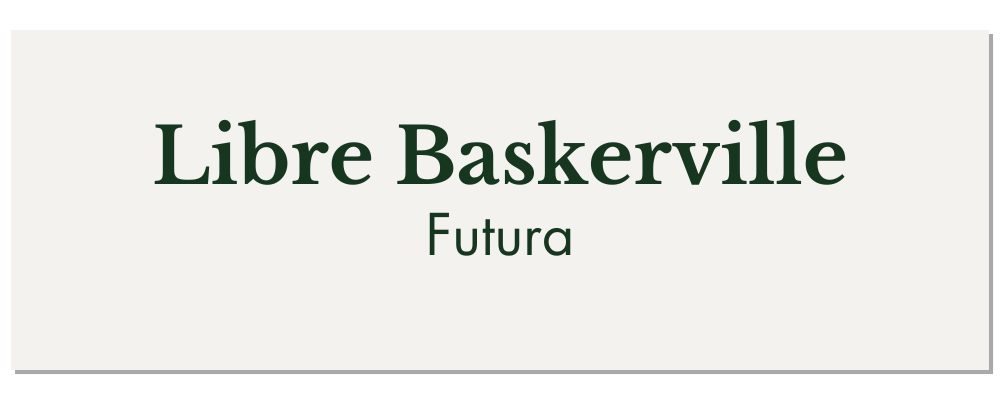
Libre Baskerville & Futura
Libre Baskerville is known for its sleek look and can work in both headers and body text typically at 16px. Great for design, architecture and tech.

Cinzel & Quicksand
When decorative serif and clean sans-serif collide - Use on websites for bold visual identity.

Poppins & Raleway
Clean, minimalist, yet elegant. Raleway is great for body text, and while I’ve read that Poppins is suitable for headings and subheadings, I have to say I’ve seen it come up more as body text and there’s good reason for this. Poppins letterform is nearly monolinear, created with an even typographic colour. Poppins is one of the most used fonts on the internet, with more than 8.37 billion times served and featured on more than 23 million websites.
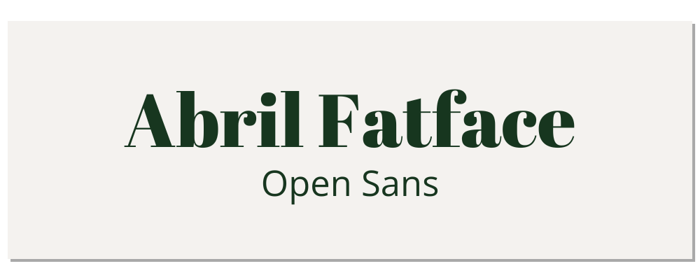
Abril Fatface & Open Sans
The perfect example of contrast, with Abril Fatface and its bold contrast for headings along with Open Sans for readability and sleekness.

Dancing Script & Lora
We can’t pair fonts without having a selection of script fonts in our list. For a more decorative and artistic look, try Dancing Script, along with Lora for great readability in body text. Perfect for bloggers, weddings, photographers or lifestyle.

Great Vibes & Roboto
Wonderfully flowing script paired with a clean and versatile sans-serif font. Feminine and playful. Roboto tops the trend charts with over 660 million websites and an incredible 53.7 billion times served from Google fonts API
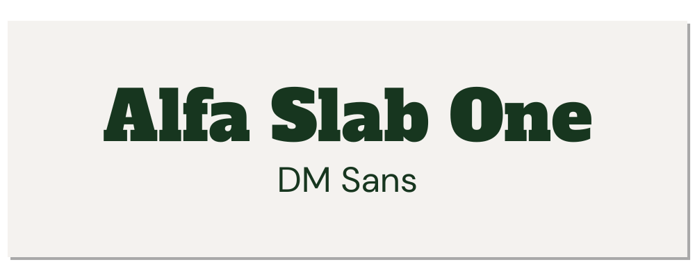
Alfa Slab One & DM Sans
Aiming for a bold and unique look? Consider Alfa Slab One, a contemporary font with its uttermost stem weight, big serifs and density. It’s giving early nineteenth-century vibes along with DM Sans, a low-contrast geometric sans serif font intended for small text size.
Final Thoughts
A well-designed website is vital for businesses and professionals to showcase their services and attract potential customers. No matter what business, it’s important to hone in on your personality and tone through visual elements, and your website’s fonts should never be overlooked.
What are your thoughts? Do you have some favourite combinations you’d like to share? I’d love to hear them in the comments below!
Thanks so much for reading, and if you like this post, please share it on Pinterest! ↓