

DIY Website Mistakes Designers Notice Immediately (And How to Fix Them)
This page may contain affiliate links. If you click on a link and make a purchase, I may receive a small commission at no cost to you. I only recommend products and services that I genuinely believe in and use myself.
So, you built your website yourself — amazing! You’ve put in the hours, made the coffee-fueled edits, and hit publish. But still, something’s not quite clicking.
Maybe inquiries are trickling in slowly. Maybe you’re wondering if it looks “legit” to strangers. Maybe you know it’s not bad… but it’s not working as well as it should.
As a Squarespace designer who works with coaches, creatives, and service providers, I’ve seen all kinds of DIY-started websites. And while most of them have potential, they also tend to share the same 5 mistakes — small design and strategy missteps that are easy to overlook but powerful enough to hurt your conversions.
The good news? These mistakes are very fixable — and I’ll walk you through how.
1. Your Homepage Doesn’t Say What You Do — Fast
The Mistake:
You’ve led with a poetic line or a clever tagline… but your visitor still doesn’t know what you offer or who it’s for.
The fix:
Your above-the-fold (the part of the homepage that’s visible before scrolling) should clearly state:
Who you serve
What you do
The outcome you help people achieve
Example:
❌ “Helping You Shine Online”
✅ “Custom Squarespace Websites for Coaches Who Want to Attract More Dream Clients”
Use a strong H1 headline, a short supporting sentence, and one clear CTA button (like “View Templates” or “Book a Call”).

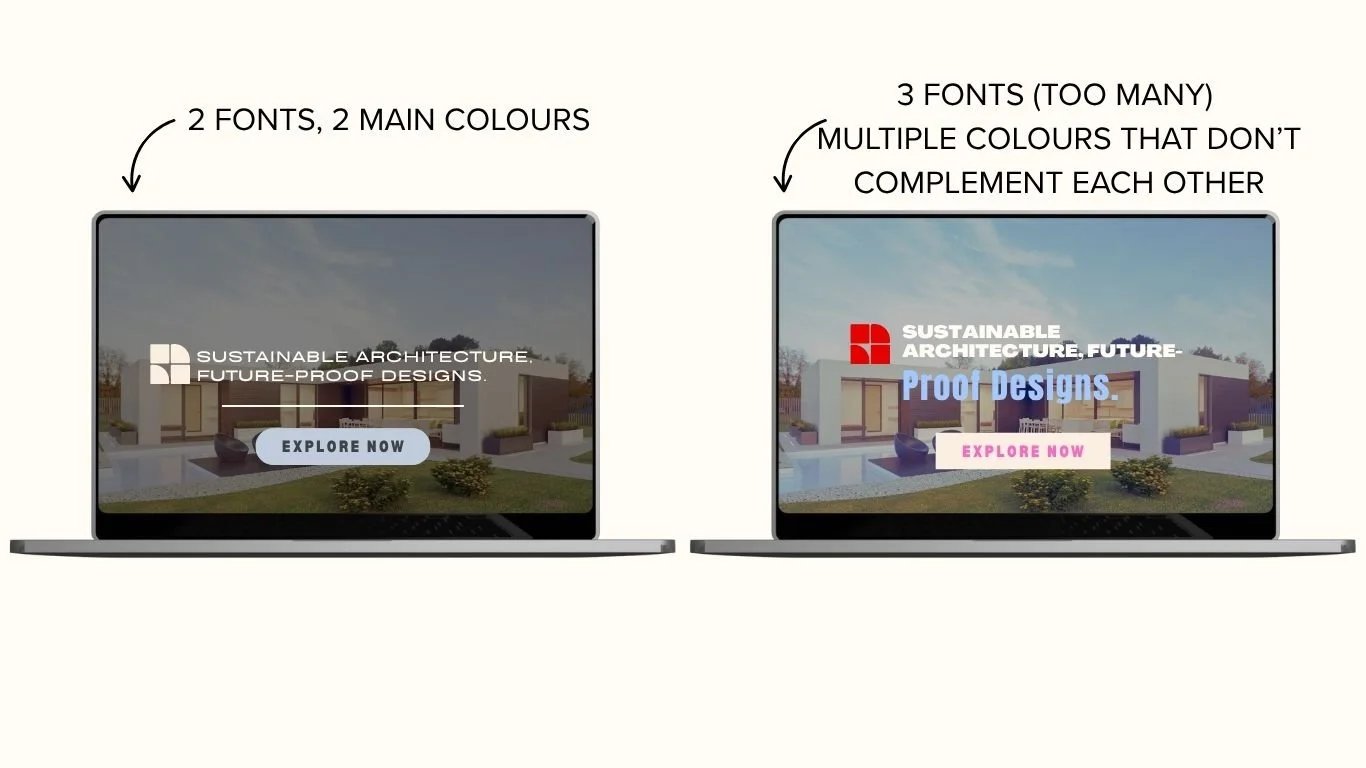
2. Inconsistent Fonts or Clashing Colours
The mistake:
You’re mixing fonts, changing colours from page to page, and using inconsistent spacing, which makes your site feel unprofessional.
The fix:
Stick with:
1 header font + 1 body font (make sure they’re easy to read)
4–5 brand colours max (background, primary, accent, neutral, CTA)
Squarespace’s Site Styles panel makes it easy to apply consistent fonts and colours throughout your site.
Design tip: Make sure buttons, section padding, and image sizes match across pages for a clean feel.
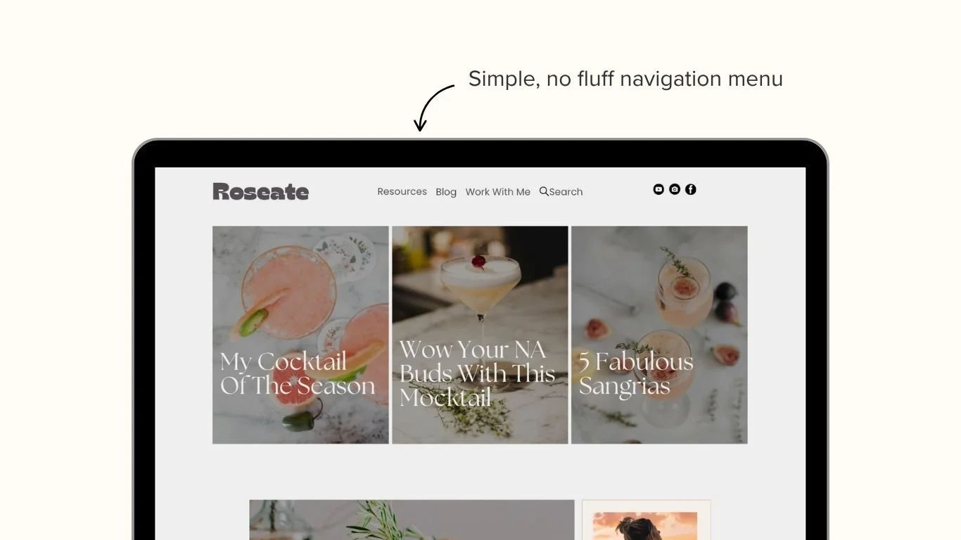
3. Your Navigation Menu is Overloaded
The mistake:
You’ve added every page you’ve ever created to your top menu. It’s overwhelming and hard to follow.
The fix:
Streamline your main nav to the essentials:
Home
About
Services or Templates
Blog (optional)
Contact
Use dropdowns sparingly, and move lower-priority pages (like legal, freebies, or resources) to your footer.
Squarespace tip: You can drag and drop your navigation structure in the Pages panel to clean it up fast.
4. Stocky, Generic, or Low-Quality Imagery
The mistake:
Your images don’t reflect your brand, feel like generic stock, or are poorly cropped and/or resized.
The fix:
Even if you don’t have professional brand photos yet, you can still elevate your visuals:
Use on-brand mockups for digital products
Style your graphics in Canva with your brand colours
Choose imagery that reflects your ideal client’s lifestyle or goals
Avoid filters that muddy your brand colours. Stick with light, clean, professional-looking photos.
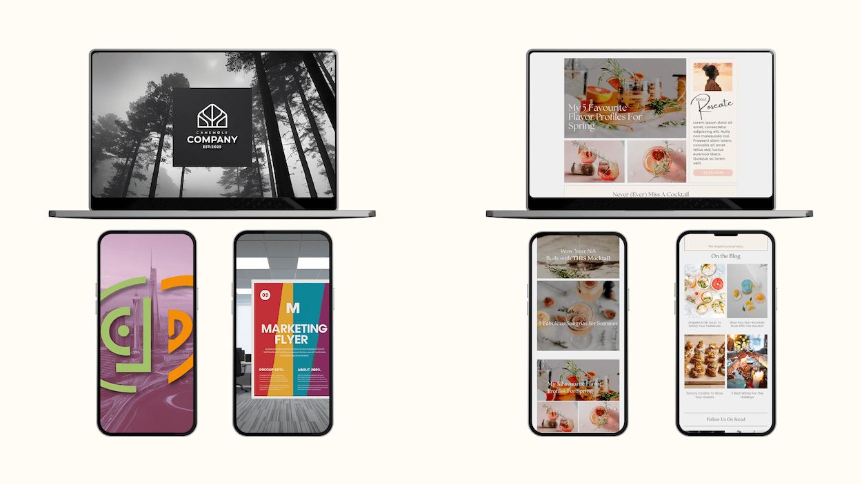
Here are two examples of stock images chosen for the respective brands. On the left, there’s forests and cities, grayscale images, and on the right, there’s images of food, with the same colour tone to match all throughout the food brand.
5. There’s No Clear Next Step (aka CTA Confusion)
The mistake:
Visitors are reading your content… but then what? They’re not being guided anywhere.
The fix:
Each page should lead to one intentional next step. That could be:
Downloading a freebie
Viewing a service
Filling out your contact form
Write CTAs that speak directly to the benefit of clicking. Use action-forward phrases:
“Snag the Free Checklist”
“Browse Website Templates”
“Book a Free Call”
Use Squarespace’s button blocks and repeat your CTA at both the top and bottom of the page to catch people at different points in their scroll.

Final Thought: DIY Doesn’t Mean “Just Good Enough”
You’re building something meaningful, and your website should reflect that. These mistakes don’t mean you’ve failed — they mean you’re closer than you think. With a few intentional edits, your Squarespace site can go from “looks okay” to “booked out.”
Want a little help in the thought process, or a little shortcut?
Download my Free 5-Minute Website Prep Checklist — it walks you through exactly what to check, tweak, or toss before you even begin to build and design your website.


