
Pantone’s 2025 Colour Is Here, And I Couldn’t Be More Thrilled!

Photo by Kaboompics
If you were busy in December–you know with the holidays and all–and haven’t read the news, let me be the first to tell you, with great joy, that Pantone Colour Institute has announced the Colour of the Year for 2025: Pantone 17-1230 Mocha Mousse
“Underpinned by our desire for every day pleasures, PANTONE 17-1230 Mocha Mousse expresses a level of thoughtful indulgence. Sophisticated and lush, yet at the same time an unpretentious classic, PANTONE 17-1230 Mocha Mousse extends our perceptions of the browns from being humble and grounded to embrace aspirational and luxe.”
Great joy! I have always been attracted to neutral tones, intense browns, and cream colours. They have a sense of warmth and richness that remains beautiful and comforting no matter where or how you use them.

Image: Unsplash
Chromatic harmony can feel luxurious. It’s moody, too. Take a walk in the fall, and you’ll feel relaxed and calm from the deep browns of the earth and the warm tones of the red and orange leaves. Look down at a warm, foamy cappuccino in a cozy cafe with a deep chocolate interior design, brick walls, and ambient lighting. Mocha Mousse can be found everywhere.
In this blog post, I will talk about how this colour can be applied to your web design content without compromising your brand’s identity.
Accent Color:
When you think of accent colours, you sometimes think of bright complementary colours that pop. But accents can also fall within your chromatic harmony when applied as a contrast. Consider your buttons, headlines and icons and add some deep mocha browns against a pale cream background, or, use a deep beige background and apply the opposite.
Background Elements: Use Mocha Mousse for subtle background elements, such as gradients or patterns. This can create a more sophisticated and modern look.
Typography: Experiment with using Mocha Mousse for specific typography elements, like headings or subheadings against lighter backgrounds
Bold Integration:
Exclusive Offerings: Introduce limited-edition products or packaging featuring Mocha Mousse prominently.
Trend-Based Campaigns: Develop marketing initiatives featuring the "colour of the year" to foster visual connections with your audience
Seasonal Promotions: Integrate Mocha Mousse into seasonal designs, such as fall or winter campaigns, to maintain relevance and capitalize on current trends.
Consider The Following:
Colour Psychology: Associated with comfort, warmth, and indulgence
Brand Guidelines: Ensure that the integration of Mocha Mousse aligns with your brand's existing guidelines.
Target Audience: Consider your target audience's preferences and how they might perceive the colour.
Visual Hierarchy: Use Mocha Mousse strategically to guide the viewer's eye and highlight important information.
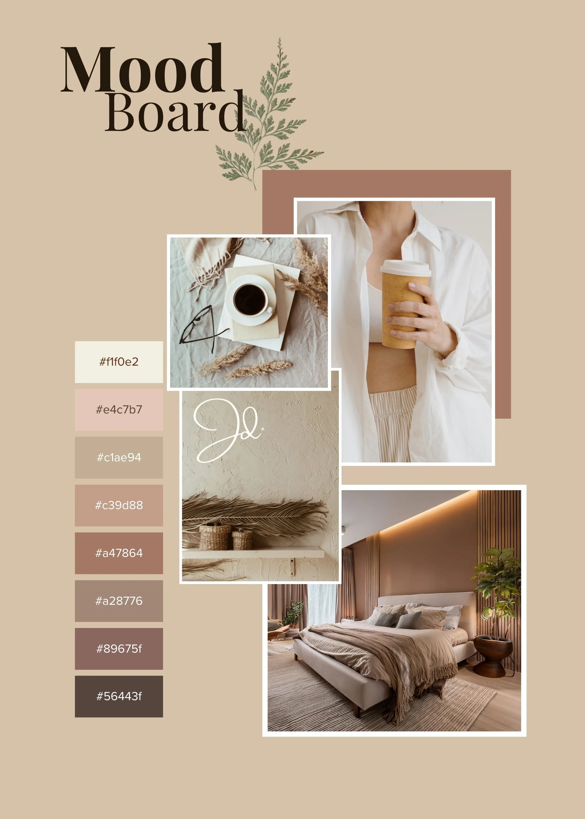
Time for the fun part! I’ve created some mood boards with Canva that you can pin to your Pinterest. What do you think of this year’s colour? Is it right up your alley, or would you rather not? I’m excited to see what creations I come up with this year using the browns and mocha palettes!

Pin this Moodboard!

Pin this!
Pin this Moodboard!

Pin this!